Overview
The Provider Analysis dashboard allows you to benchmark your pricing against similar organizations in your region and specialty. Requirements for this dashboard include:- Access to Provider Profiles
Accessing the Dashboard
You can access this dashboard from your organization’s home screen by clicking the “Provider Analysis and Peer Comparison” card.Filters and Navigation

Navigation
The dashboard is organized into two primary sections:- Provider Overview: High-level insights and market positioning for your provider organization
- Competitor View: Detailed comparisons against specific competitor organizations in your market

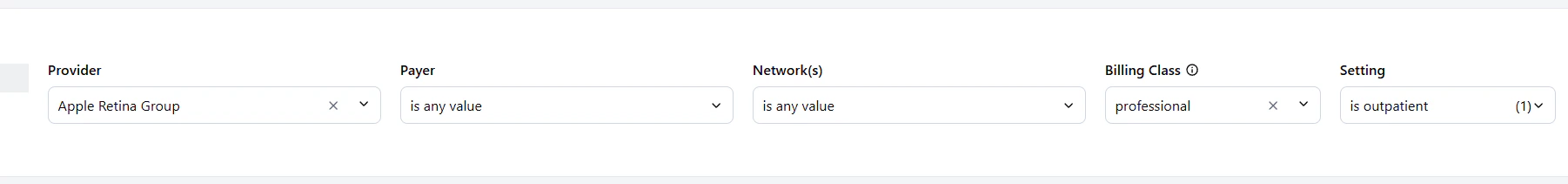
Filtering Your Analysis
The filter bar at the top of the dashboard allows you to refine your analysis based on specific criteria. You can filter by provider, market, payer, network, billing class, and care setting. These filters apply across dashboard views in your session, allowing you to maintain a consistent analysis context as you navigate. Filters apply to all tables at once, so filtering by a payer like UHC narrows the Contract Percentiles, fee schedule, and market tables to that payer. Billing Class vs. Setting: Billing Class refers to how the service is billed (professional vs. institutional), while Setting refers to where care is delivered (inpatient/facility vs. outpatient/non-facility). They are independent filters. Available Filters:- Provider: Select specific providers to analyze their pricing data.
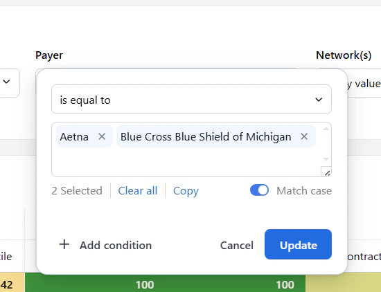
- Payer: Filter by specific insurance payers to see how your rates compare against them.
- Network: Filter by network type (e.g., in-network vs. out-of-network) to understand how your rates perform in different contexts.
- Billing Class: Filter by billing classification (e.g., professional vs. institutional) to analyze specific types of services.
- Setting: Filter by care setting (e.g., inpatient (facility) vs. outpatient (non-facility)) to see how your rates compare in different healthcare environments.
Exporting Your Data
You can export data from any table in the dashboard by clicking the three-dot menu in the top-right corner of the table and selecting “Download.” This lets you download the data in CSV, Excel, PDF, or PNG format for further analysis or reporting.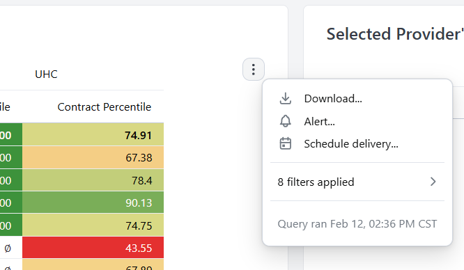
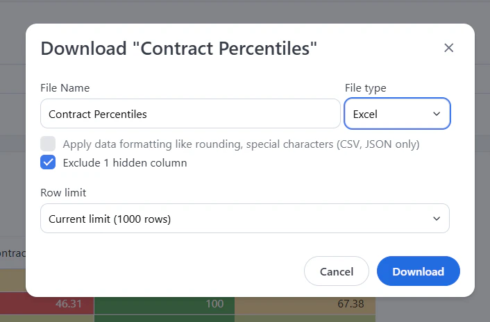
- Always select “Exclude Hidden Columns” if you have applied filters to ensure you only download the relevant data.
Dashboard Components
Contract Percentiles Table
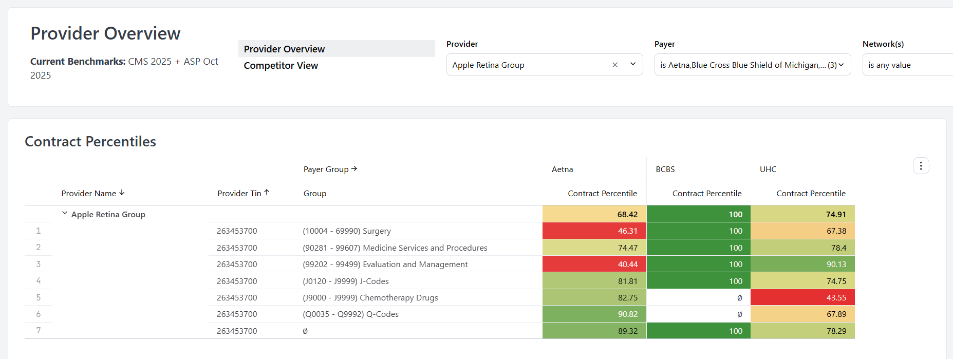
- BCBS (Blue Cross Blue Shield)
- Cigna
- Aetna
- UHC (UnitedHealthcare)
- Regional payers
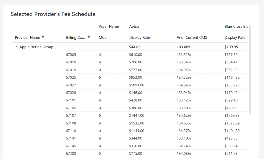
Selected Provider’s Fee Schedule
This table displays your provider’s current contracted rates for various payers. Each row represents a specific contract with detailed information including:- Payer Name: The insurance company name
- Billing Code: The specific CPT or procedure code
- Mod: Modifier codes that affect reimbursement
- % of Current CMS: Your rate expressed as a percentage of Medicare rates. Rates are expressed as a percentage of the Medicare-allowed amount, so 150% means the contract pays 1.5 times what Medicare would.
- Display Rate: The actual dollar amount for the procedure
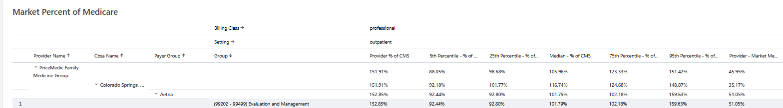
Market % of Medicare
This table compares your provider’s rate (Provider % of CMS) against the full market distribution at each percentile level, broken down by market, payer, and billing code group. The rows are organized as an expandable hierarchy. You can expand or collapse each level to drill from your provider organization, down through market and payer, to a specific billing code group. Two context rows at the top show Billing Class (for example, professional) and Setting (for example, outpatient), reflecting the active filters. Columns:- Provider Name — your provider organization.
- CBSA Name — the market (Core-Based Statistical Area).
- Payer Group — payer aggregation (Aetna, Cigna, UHC, etc.).
- Group — billing code group.
- Provider % of CMS — your rate as a percentage of the Medicare-allowed amount.
- 5th, 25th, Median, 75th, 95th Percentile — the market distribution at each percentile, expressed as % of CMS.
- Provider Market Percentile — where your provider falls within that market distribution.