> ## Documentation Index
> Fetch the complete documentation index at: https://docs.pricemedic.com/llms.txt
> Use this file to discover all available pages before exploring further.
# Competitor View
> Compare selected competitor groups and geographic coverage
## Overview
The Competitor View in the Provider Analysis dashboard helps you select competitor organizations, review selected groups, and understand geographic distribution.
## Competitor Selection
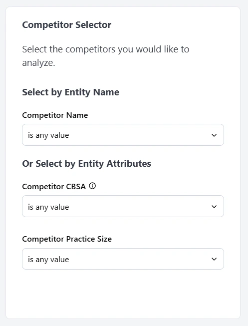
Use the left panel to build and refine your competitor set.
* **Select by Entity Name**: Search and add competitors directly by organization name.
* **Select by Entity Attributes**: Filter competitor candidates by attributes such as CBSA and practice size.
Use these controls together to create a peer set that matches your market, scale, and competitive context.
 ## Selected Groups View
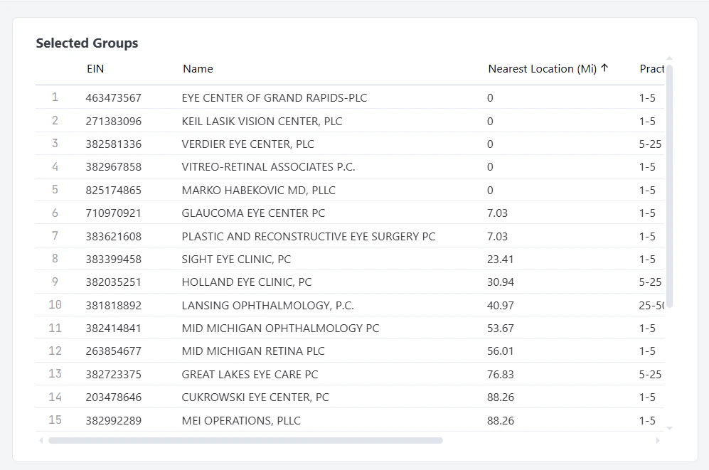
The Selected Groups table displays the organizations currently included in your competitor set.
Each row represents one competitor group and includes key comparison fields, such as:
* **EIN**
* **Name**
* **Nearest Location (Mi)**
* **Practice Size**
Use this table to review who is currently included, confirm proximity and size alignment, and adjust your selection before deeper pricing analysis.
## Selected Groups View
The Selected Groups table displays the organizations currently included in your competitor set.
Each row represents one competitor group and includes key comparison fields, such as:
* **EIN**
* **Name**
* **Nearest Location (Mi)**
* **Practice Size**
Use this table to review who is currently included, confirm proximity and size alignment, and adjust your selection before deeper pricing analysis.
 ## Map
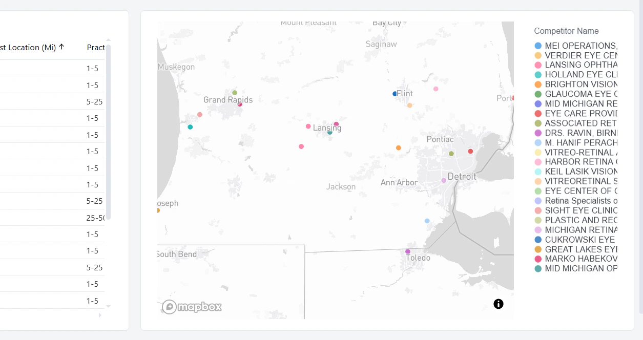
The map visualizes selected competitor groups by location.
* Each marker represents a selected competitor group.
* The legend on the right matches marker colors to competitor names.
* Use the map with the Selected Groups table to validate geographic coverage and spot clusters or gaps in your peer set.
This view helps ensure your comparison group is both strategically relevant and geographically appropriate for your analysis.
## Map
The map visualizes selected competitor groups by location.
* Each marker represents a selected competitor group.
* The legend on the right matches marker colors to competitor names.
* Use the map with the Selected Groups table to validate geographic coverage and spot clusters or gaps in your peer set.
This view helps ensure your comparison group is both strategically relevant and geographically appropriate for your analysis.
 ## Selected Groups Fee Schedules
Below the competitor selection and map, the dashboard includes a detailed table that shows fee schedule values for all selected groups. This section helps you compare reimbursement rates side by side across competitors and your target group.
### Billing Code Selection
Use the Billing Code Selector panel to choose the code groups and individual billing codes you want to analyze.
* **Billing Code Group** narrows the analysis to a category of services.
* **Billing Code** lets you focus on specific procedures within the selected group.
These selections control which rows appear in the fee schedule table and the related distribution view.
### Fee Schedule View
The fee schedule table displays selected groups as columns and billing codes as rows so you can compare contracted rates directly.
For each selected group, this view can include details such as:
* **Payer Name**
* **EIN**
* **Competitor Name**
* **Org # of Providers**
* **Billing Class**
* **Setting**
* **Display Rate**
Use this view to identify pricing gaps and spot where your rates are above or below competitor benchmarks for the same services.
### Percent of Medicare View
The Percent of Medicare view summarizes negotiated rates as a percentage of current CMS values.
* The distribution plot highlights how selected competitors are positioned by billing code.
* The ranking table provides a quick list of competitor performance using **% of CMS**.
Together, these views help you evaluate relative contract strength and prioritize opportunities for rate improvement.
## Configuring a Comparison
Run a side-by-side comparison of a competitor against your provider to see how your rates stack up.
* **Open the Provider Analysis dashboard** and navigate to the Competitor View.
* **Open the Competitor Name tab**. This is where you build the side-by-side comparison.
* **Select your provider first**. Choose your provider from the Competitor Name list so it anchors the comparison.
* **Pick the competitor to compare against**. All available groups appear in the Selected Groups table. Choose the one you want and add it to the filter.
* **Review the side-by-side view**. Your provider and the selected competitor display next to each other, with your provider's rates highlighted and the competitor's rates to the right.
* **Filter by payer (optional)**. Narrow to a specific payer to see the comparison for that payer only.
* **Filter by billing code or code group (optional)**. Drill down to a single billing code, or a billing code group, to compare rates for specific services.
* **Export (optional)**. Click the three-dot menu and select Download to export the comparison as a PDF, CSV, or Excel file.
## Selected Groups Fee Schedules
Below the competitor selection and map, the dashboard includes a detailed table that shows fee schedule values for all selected groups. This section helps you compare reimbursement rates side by side across competitors and your target group.
### Billing Code Selection
Use the Billing Code Selector panel to choose the code groups and individual billing codes you want to analyze.
* **Billing Code Group** narrows the analysis to a category of services.
* **Billing Code** lets you focus on specific procedures within the selected group.
These selections control which rows appear in the fee schedule table and the related distribution view.
### Fee Schedule View
The fee schedule table displays selected groups as columns and billing codes as rows so you can compare contracted rates directly.
For each selected group, this view can include details such as:
* **Payer Name**
* **EIN**
* **Competitor Name**
* **Org # of Providers**
* **Billing Class**
* **Setting**
* **Display Rate**
Use this view to identify pricing gaps and spot where your rates are above or below competitor benchmarks for the same services.
### Percent of Medicare View
The Percent of Medicare view summarizes negotiated rates as a percentage of current CMS values.
* The distribution plot highlights how selected competitors are positioned by billing code.
* The ranking table provides a quick list of competitor performance using **% of CMS**.
Together, these views help you evaluate relative contract strength and prioritize opportunities for rate improvement.
## Configuring a Comparison
Run a side-by-side comparison of a competitor against your provider to see how your rates stack up.
* **Open the Provider Analysis dashboard** and navigate to the Competitor View.
* **Open the Competitor Name tab**. This is where you build the side-by-side comparison.
* **Select your provider first**. Choose your provider from the Competitor Name list so it anchors the comparison.
* **Pick the competitor to compare against**. All available groups appear in the Selected Groups table. Choose the one you want and add it to the filter.
* **Review the side-by-side view**. Your provider and the selected competitor display next to each other, with your provider's rates highlighted and the competitor's rates to the right.
* **Filter by payer (optional)**. Narrow to a specific payer to see the comparison for that payer only.
* **Filter by billing code or code group (optional)**. Drill down to a single billing code, or a billing code group, to compare rates for specific services.
* **Export (optional)**. Click the three-dot menu and select Download to export the comparison as a PDF, CSV, or Excel file.